
There has been a new wave of designing basketball courts across the nation. Many have ditched their look for new ones that will make them stand out, but some have gone the extra mile to do that. Some new courts are awesome, while some make you wonder what the logic was behind the design. Many are redesigning their basketball courts to distance themselves from the rest of the competition. It has to be big tool for use in recruiting. Here’s a look at some the best designs out there.
10. Indiana
This list goes on with a lot of new courts that have followed the wave of having new court designs, but I would like to start out with a classic court. This is a shout out to all you Duke, Kentucky, and North Carolina fans, too. You can never go wrong sticking to tradition. There is not a more “basketball” state than Indiana. This is one of the most traditional courts around. These fans wanted the court to stay the same so much they did not even want to add the Big 10 logo (but the league made it mandatory). Having nothing special makes this one easy on the eyes. The court stays the same across the way just with the red three point line. This court’s simplicity captures all of what basketball is to storied programs like Indiana.
9. Oregon
Does Oregon do anything that is consistent with other athletic programs? When I first saw this court, I did not understand what this was even going for. The “Deep in the Woods” design is definitely not one that anyone else has in the rest of college basketball. What puts this court in the list is how the color of the wood changes from dark on the outside to lighter of the court to the inside. Then there is the unique arena logo directly under the Oregon “O”. Chalk another one up for Phil Knight and his boys.
8. UCF
This is one of the coolest courts out there. There are no special adds to this court, just awesome coloring. The dark gray matches perfect with the black and gold UCF logo. Everywhere is stained dark, except inside of the three-point line.
UCF said they wanted it to imitate an outside basketball court.
7. Notre Dame
The huge four-leaf clover at half court fits perfectly here. You can easily tell that it is there, but it is a lighter wood rather than actually being green. The colors of the court are nice with the inside of the three-point line being a lighter shade of the wood. Then the blue really highlights the rest of the court and puts the stamp on with the ND in the center. I mean the clover has to give them some luck, right?
6. UTEP

The Miners didn’t settle for the one pickaxe in the logo, they added two picks on each side of the floor that take up each side of the court. Everything is bigger in Texas, right? It is a lot, but this design is not chaotic and can easily be seen. As some schools design courts that do not deal with the school’s nickname, this does a good job recognizing the Miners.
Image credit: http://transformations.utep.edu
5. Cal State Bakersfield
This may be a little much, but you can’t say that they didn’t go all out. Yes, they may have taken a page from Boise State’s football field, but they were the first ones to have a fully blue court in college basketball. Do not sit to close to the TV when watching these guys, as it is a lot to take in for the eyes. Some say that the blue court gives them a headache, but I think it’s pretty awesome.
Image credit: Athlon Sports
4. Long Beach State

With the school being located a whole three miles for the shoreline, this is a good look for the court. The four palm trees truly capture the California feel. I love the midcourt “The Beach” instead of using a Long Beach logo. The Long Beach administration and coaches looked at up to 10 different designs, but I’m sure this one had to win easily.
Image credit: Long Beach State
3. San Jose State
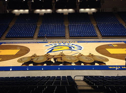
Back in 400 B.C., there was nothing more intimidating than the Spartans. Five Spartans, shoulder to shoulder with shields and spears drawn, is what makes this court design what it is. Maybe this is what San Jose wants its five starters to come out like? You can’t help but think of the movie “300” when you see this court. I think to go along with the court they should play “This is Sparta!” every time they score a basket.
Image credit: San Jose State Spartans Facebook page
2. Memphis

This court really puts the city’s stamp on it. The court design was opened to online voting by fans, with this winning design garnering 50 percent of the total votes out of the four possible choices. With the skyline and bridge going across the bottom of the floor, it shows the city wanted to show something that will show everyone Memphis when they are playing on TV. It is doing so in a way that is enough, but not doing too much. This is one of my favorites out there.
Image credit: GoTigersGo.com (University of Memphis Athletics)
1. FIU
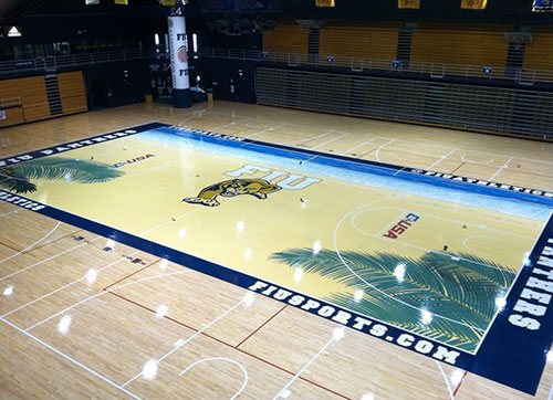
Is there anywhere else you’d rather be right now than the beach? The FIU court has the full beach effect with the sand, water, and the trees on the edge. Some traditional folks would say this is overdone, but I believe this is the greatest court design there is. I bet it’s hard being a FIU basketball fan, so at least you can look at this court when you go to the games. Maybe they should put beach chairs courtside to really have the beach atmosphere.
Image credit: FIUSports.com (Florida International University Athletics)

Leave a comment